 Discomorphism
May 2026 7 min read
The dumb little joke
I was in Japan with my family, sitting in our onsen, scrolling X. Spotify had just changed its app icon for its 20th anniversary. The normal green icon was gone. In its place was a shiny green disco ball with the Spotify lines wrapped across it.
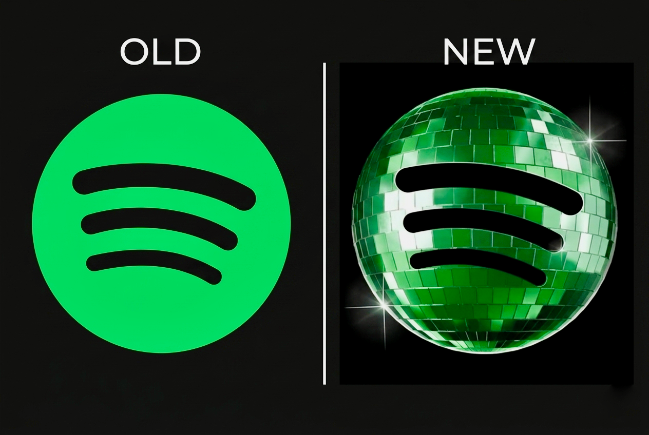
There were a lot of reactions on X. Some people loved it, a lot of people didn't, and most were just confused about why Spotify's icon suddenly looked like a disco ball.
I thought it was funny, so I made a quick joke: Discomorphism. A fake design-trend name for a disco-ball app icon. I posted it, laughed, and went back to vacation.
Within a few hours, the post started moving. By that evening it was at 473K views. By the next morning it was past 20K likes, 1.2K reposts, 318 replies, and 2M views. The comments filled up with people tagging brands and dropping their own disco-ball mockups.
The internet got weird fast
What started as a quick joke about Spotify's disco-ball icon turned into an internet moment. Within a day or two, people started applying the same look to other app icons. Some looked good, some looked cursed, and most were easy to remix.
9to5Mac covered the original icon drama early and framed it as a temporary anniversary thing. Spotify said the regular logo would come back after the 20th-anniversary moment. The bigger point they landed on was simple: people take their home screen seriously.
That was the tension. Spotify made a temporary birthday icon, but everyone else saw a giant glittery object sitting in a grid of small, serious app squares. Then the name gave people something to copy.
The brand pile-on
The first wave was creators and people inside companies riffing on the idea. Ian Tracey at Ramp posted a disco-ball Ramp icon super early, Andrew Qu from Vercel posted a mirrored Vercel triangle, Descript jumped in with a disco D, and MetaMask turned the fox into a mirrored orange disco head.
Then the brand accounts showed up. Cash App posted a glossy green disco dollar sign, Gamma posted a disco-ball G, GitHub posted a mirrored Octocat, and beehiiv, Notion, Figma, Lovable, and a bunch of others joined from their own corners of the internet.
The press noticed
Pretty quickly, the trend jumped from X into marketing, design, and tech media. PiunikaWeb ran with the headline "Meet Discomorphism" and described the pattern: people kept turning app icons into shiny, reflective disco versions, and the word "discomorphism" was circulating as shorthand for the style.
Brandfinity treated it like a brand moment and called it one of the fastest branding conversations of 2026. Their read: the shift from flat, minimal design to a textured, glittery look kicked off a bigger conversation about design taste.
Around the same time, TBPN covered the trend on its daily tech news show. That felt like a different kind of validation than another brand account joining in. TBPN had become one of the places tech people were actually watching to keep up with what was moving that day. OpenAI had acquired TBPN recently, which made the segment carry more weight. If John Coogan and Jordi Hays were talking about discomorphism, it had moved past a random X joke and into the broader tech conversation.
Here's John Coogan on the show:
Brands like joining in on a meme can be like done really poorly. This one seemed like it was fun.
Then it hit a show I actually listen to. The Waveform podcast (MKBHD's show) ran a full segment on it, walking through the whole arc: my original post, Sameer quote tweeting it, and disco icons landing on Pixel. They credited me directly and called it "a Race Johnson coinage." I caught it on my Friday morning run, which was a wild way to hear my own name come through the headphones.
Regardless, we got Discomorphism. So this has now been coined. It's a Race Johnson coinage.
The joke became a tool
The weirdest part was how fast the joke turned into actual tools. Lovable shipped a public web app at discomorphism.lovable.app where you could upload a logo and turn it into a disco-ball icon.
Other tools followed quickly. Prompt threads started showing up, PiunikaWeb included a ChatGPT prompt for recreating the effect, power.ai used the Lovable app as a case study for building with AI, and people collected examples into galleries. Some also started complaining there were already too many examples, which was probably the clearest sign the trend had stopped needing me.
The backlash and remixes
The backlash showed up right on schedule. Ding posted a complaint about being done with discomorphism while also linking to multiple sites and galleries full of disco-ball logos. Both a complaint and a directory. Once people are tired of a trend 3 or 4 days in, it probably has legs.
Then the remixes started. Figma posted a balloon-style version of its icon, Ilya Miskov applied the balloon treatment back to Spotify, and Alessia Pacca rebuilt the Figma logo out of Lego bricks. The format had gotten bigger than the disco ball: take a visual gag, give it a serious design name, and let the internet remix it.
Then Google actually shipped it
The biggest turn was Google. Sameer Samat, President of the Android Ecosystem at Google, replied directly and asked if Android should make the icon pack happen. At first it felt like a funny platform-exec riff: a Chrome icon as a disco ball, a joke getting close to a real product.
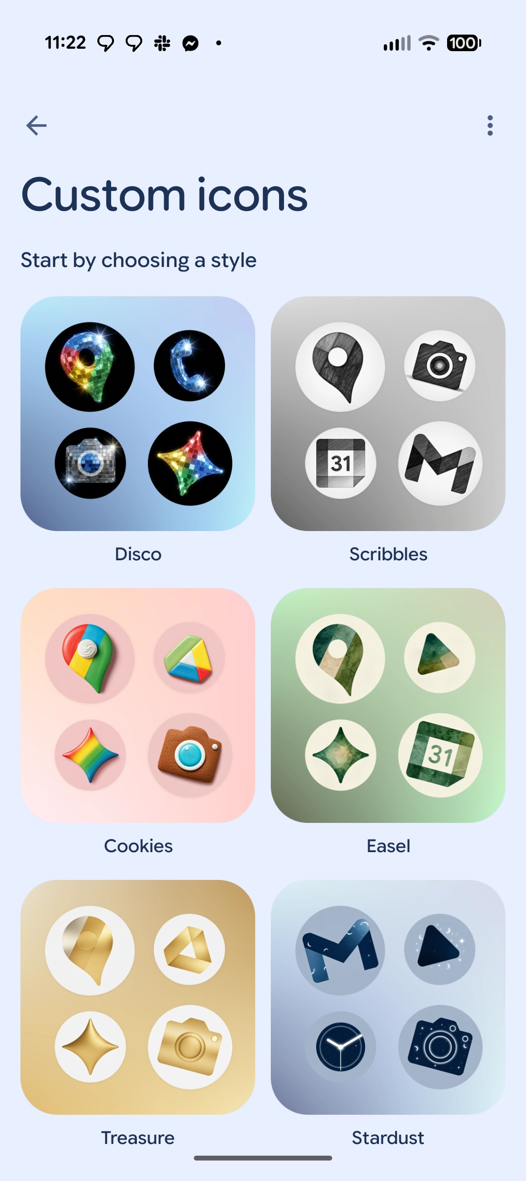
A few days later, he posted again saying Disco icons were available on Pixel. It went from a tweet I posted on vacation to a real feature on Pixel phones in less than a week.
9to5Google wrote:
The idea spawned from a Twitter/X thread where ‘discomorphism’ was shown off on certain apps such as YouTube and Claude. Samat, at the time, talked about bringing the icon pack to Android phones, but confirmed it was a serious discussion. Fast forward to today, and it has arrived.
And from Android Authority:
If you spend any time on tech Twitter, you’ve probably come across Race Johnson’s semi-viral post featuring a few app icons with a disco ball effect, cutely referred to as ‘discomorphism.’
What I take from it
The speed is what stuck with me. A joke I posted from an onsen in Japan turned into a Lovable generator, brand riffs from Cash App to Figma, a Waveform segment, and a real feature on Pixel phones, all in under a week. Idea to shipped product used to take months. This took days.
The other piece: the name did the work. "Discomorphism" gave people a handle to grab and remix on their own. Once a format is that easy to copy, it stops needing you, and that's usually right when it takes off.
I keep coming back to that. The best thing I did was give a dumb little joke a name and get out of the way.


